/* visual */
.section--visual{
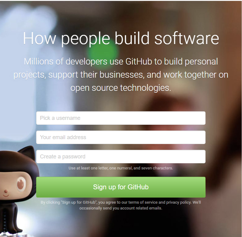
background-image: url("../img/bg-small.jpg");
}
.section--visual .inner{
display: block;
max-width: none;
padding: 80px 20px;
}
.section--visual .summary{
text-align: center;
margin-right: 0;
margin-bottom: 50px;
}
#sign-form{
width: auto;
max-width: 500px;
margin: 0 auto;
}
지금까지 미디어 쿼리 코드 전체
/* MEDIA */
@media (max-width: 1024px){
    header.section .inner{
        /* 원래 max-width가 980px이다
        초기화 할때도 max-width로 해야함
        그런데 여기서 초기화되지 않음
        우선순위가 덮어쓰기에는 약하다(header .inner)
        header.section .inner로 써서 우선순위를 높여준다 */
        max-width: none;
        height: auto;
        padding: 0 20px;

    }
    header .menu-group,
    header .sign-group{
        /* 원래 있었던 float 해제 */
        float: none;
    }
    header .menu-group{
        /* 세로로 정렬 */
        display: block;
    }
    header .logo{
        padding: 12px 0;
    }
    header .main-menu{
        /* 세로로 정렬 */
        display: block;
        margin-bottom: 10px;
    }
    header .main-menu li{
        border-top: 1px solid #e5e5e5;
    }
    header .main-menu li a{
        padding: 16px 0;
    }
   header .sign-group{
       /* 수직으로 정렬을 바꿈 */
       /* 원래 display가 flex이고 order이 있었는데
       order은 flex일때만 적용이 되어서 지금은 적용 안되고
       html구조대로 쌓인다. */
       display: block;
       padding: 10px 0 20px;
   }
   header .btn-group{
       display: block;
   }
   header .btn-group .btn{
       justify-content: center;
   }
   header .btn-group .sign-in{
       margin-right:0;
       margin-bottom: 12px;
   }
   #search-form{
       margin-top: 12px;
       margin-right: 0;
   }
   #search{
       width: 100%;
       height: 42px;
       text-align: center;
   }
   header .sub-menu{
       margin-top: 12px;
       margin-right: 0;
       justify-content: center;
   }
    header .toggle{
        /* 원래있던 header menu를 없앤다 */
        display: none;
    }
    header .toggle.on{
        display: block;
    }
    #toggle-btn{
        display: block;

    }

    /* visual */
    .section--visual{
        background-image: url("../img/bg-small.jpg");
    }
    .section--visual .inner{
        display: block;
        max-width: none;
        padding: 80px 20px;
    }
    .section--visual .summary{
        text-align: center;
        margin-right: 0;
        margin-bottom: 50px;
    }
    #sign-form{
        width: auto;
        max-width: 500px;
        margin: 0 auto;
    }

    /* feature */
    .section--feature .summary{
        padding: 66px 20px 0 20px;
    }
    .section--feature .tiles li{
        /* 두개의 colum을 사용 */
        width: 50%;
    }
    .section--feature .tiles li:nth-child(2){
        border-right: none;
    }
    .section--feature .tiles li img{
        padding: 14px 30% 24px;
    }

    /* where is */
    .section--where-is .inner{
        max-width: none;
        padding: 80px 20px 0 20px;

    }
    /* pricing card */
    .section--pricing .inner{
        max-width: none;
        padding: 80px 20px;
    }
    .section--pricing .card .cell2{
        font-size: 20px;
    }

    /* footer */
    footer .inner{
        padding: 50px 20px;
    }
    footer .logo{
        display: none;
    }
}
<link rel="stylesheet" media="all and (max-width: 1024px)" href="css/main_medium.css">미디어 쿼리 css 파일 나누기
html에 저렇게 해주고
미디어쿼리로 적었던 것들을 파일을 main_medium.css파일로 나눠준다.
<link rel="stylesheet" media="all and (max-width: 768px)" href="css/main_small.css">medium/ small/ large이런식으로 나눈다
small.css
/* common */
.summary__title{
    font-size: 34px !important;
}
.summary__description{
    font-size: 22px;
}

/* feature */
.section--feature .tiles li{
    /* tile들을 하나씩으로 바꿔준다 */
    width: 100%;
    border-right: none;
    border-bottom: 1px solid #e5e5e5;
}

/* where is */
#map{
    /* 지도가 가로로 늘어났으면 좋겠는데
    원래처럼 width가 100%이면 안된다.
    그래서 width가 초기 상태여야한다. */
    width: auto;
    margin: 40px -20px 0 -20px ;
    border-left: none;
    border-right: none;
}

/* pricing card */
.section--pricing .card{
    display: block;

}
.section--pricing .card .cell2{
    border-left: none;
    border-top: 1px solid #e5e5e5;
}

/* footer */
footer .site-links{
    float: none;
    display: block;
    text-align: center;
}
footer .site-links:first-child{
    margin-bottom: 20px;
}
footer .site-links li{
    display: inline;
}
728x90
'무작정 따라하기 > 패스트캠프(프론트)' 카테고리의 다른 글
| [깃허브 예제] toggle버튼을 화면 크기에 따라 없어지고 있게 하는 법 js코드 (0) | 2021.04.22 |
|---|---|
| [깃허브 예제] toggle버튼 만들기/ toggle버튼에 클래스를 추가함으로써 누르면 사라지고나타나게 하는 js만들기 (0) | 2021.04.22 |
| [깃허브 예제] 미디어 쿼리 / @media / 미디어 타입/ 미디어 특성/ max-width정의/ float 해제/ toggle버튼 생성 (0) | 2021.04.22 |
| [깃허브 예제] footer / svg로 로고 넣기 /배치를 바꾸지 않으면서 svg로 이미지 가운데로 배치하기 (0) | 2021.04.22 |
| [깃허브 예제] 하단 card부분 (0) | 2021.04.22 |